What Is Dopamine Decor?
The Design Trend That Makes You Feel Something
June 2026 · Design + Color · 9 min read
Your home should make you feel something when you walk in. Not just comfortable, but alive. Dopamine decor is the design movement that starts from exactly that premise.
The term has been everywhere lately: on Pinterest boards, in interior design features, and across social media feeds. But behind the trend language is a genuinely compelling idea, one that's less about following a look and more about understanding what color actually does to the brain and using that knowledge deliberately, in your furniture, your lighting, your room.
This is our guide to what dopamine decor really means, why it works, and how to do it well, with five curated color stories to start from.
Understanding the Trend
What Is Dopamine Decor?
Dopamine decor is an interior design philosophy built on a straightforward insight from color psychology: that bold, saturated hues measurably boost mood, energy, and a sense of optimism in the people who live among them. The name comes from dopamine itself, the neurotransmitter associated with pleasure and motivation, and the idea that the colors and objects surrounding you can actively trigger those same neurological responses.
It isn't a new concept in design history. Mid-century modernists like Verner Panton and Alexander Girard understood it deeply. You can see it in the Panton Chair's radical curves and the Girard® Color Wheel Ottoman's exuberant patterning. What's new is the cultural permission slip: the collective decision, post-2020, that designing for joy is not frivolous. It is, in fact, the point.
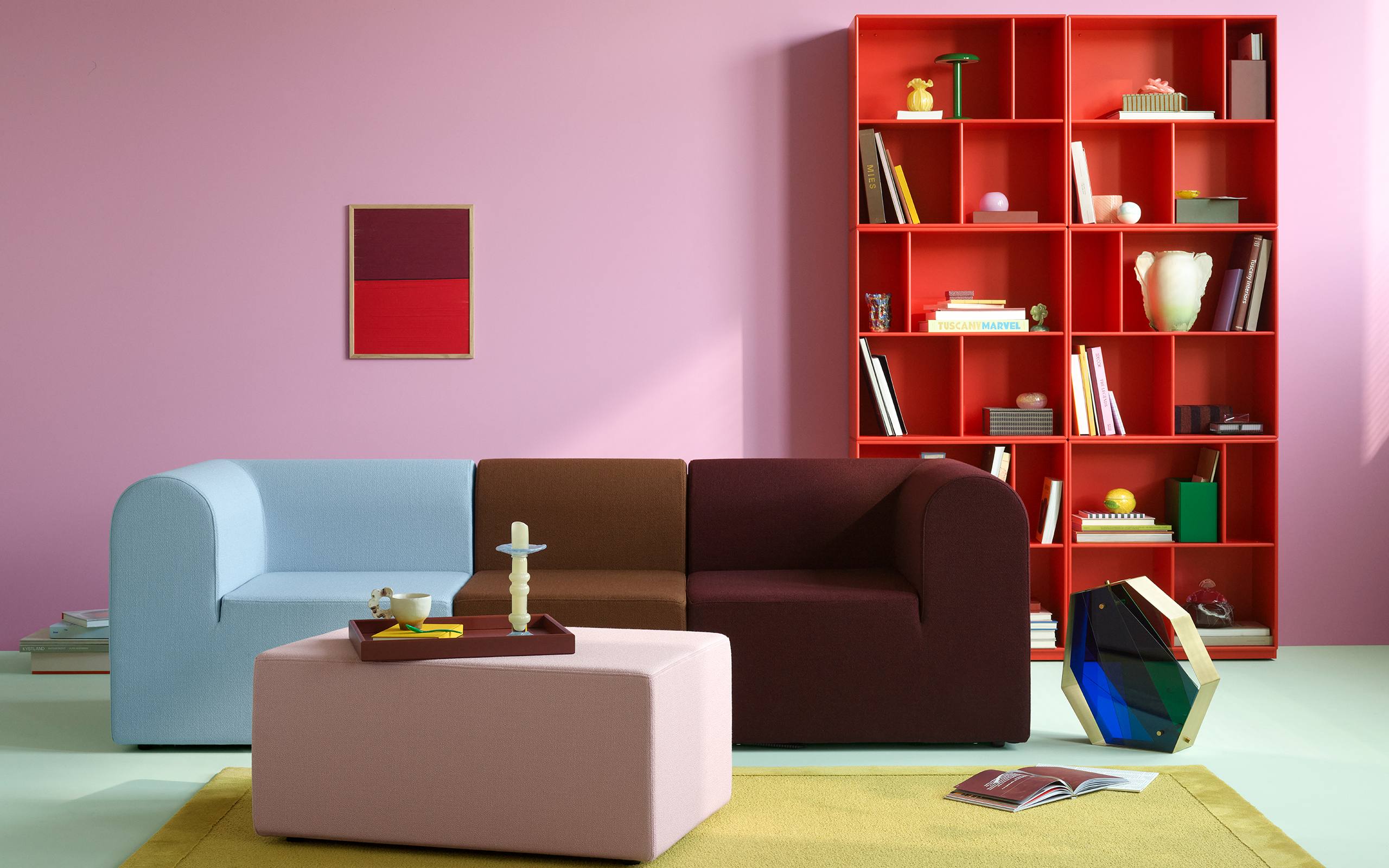
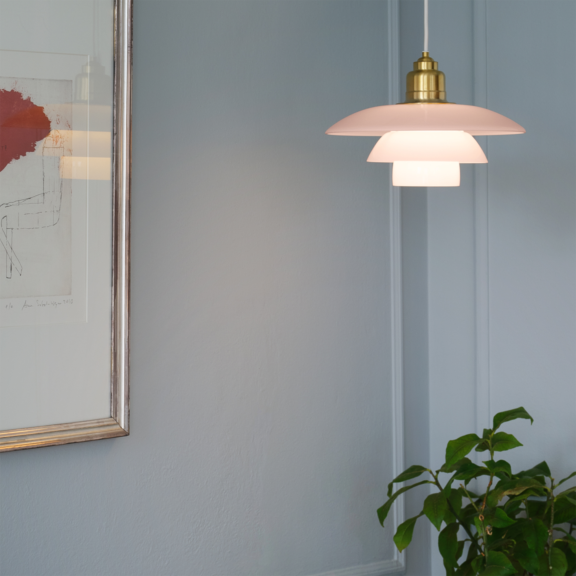
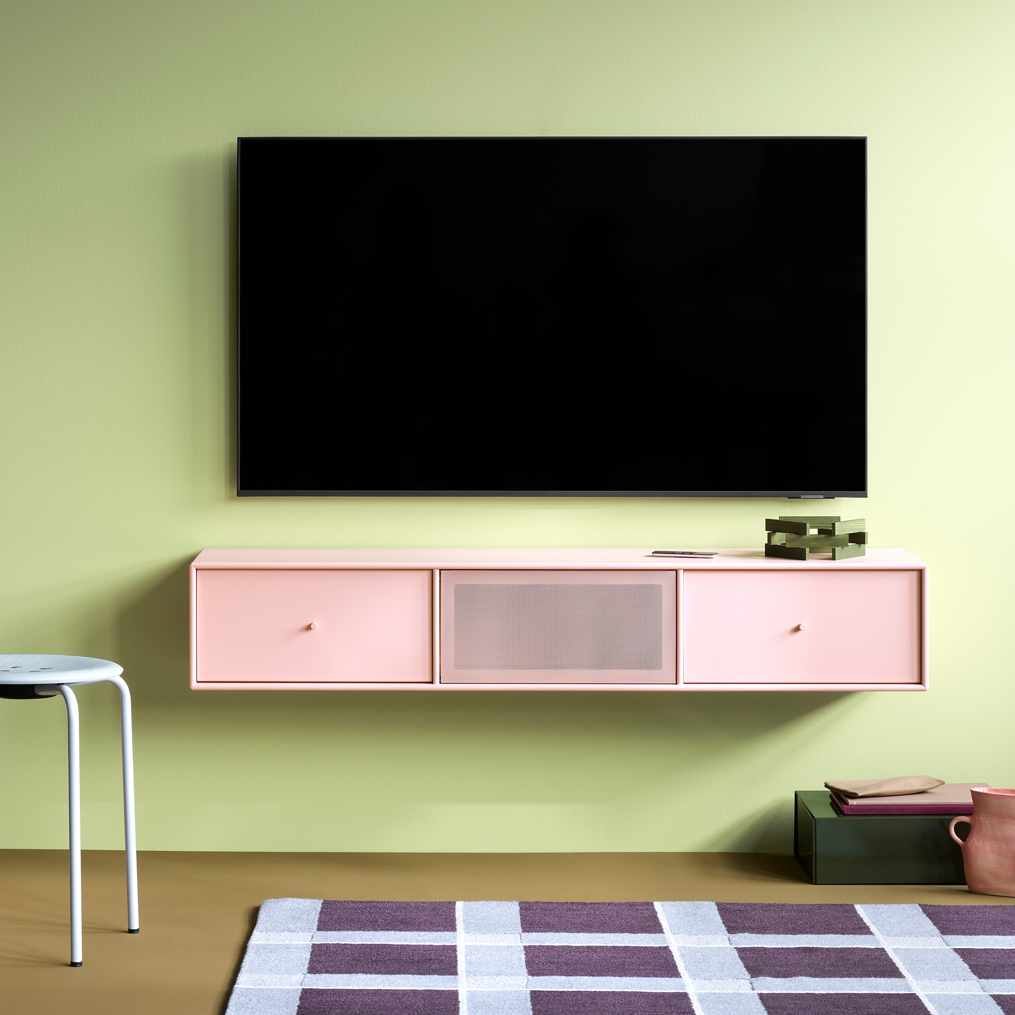
Practically, dopamine decor means choosing furniture, lighting, and objects because they make you feel something, not because they're neutral enough to disappear into the background. It means a cobalt sofa instead of a grey one. A tangerine pendant instead of matte black. A pistachio bookcase instead of white lacquer.
Dopamine decor is not about more color. It's about intentional color, chosen to make you feel exactly the way you want to feel in a room.
The Science Behind It
Why Bold Color Works
Color psychology has been studied since the early 20th century, and the evidence is consistent: the colors in our environment have a measurable effect on how we feel, think, and move through the day. Here's what the research actually says about the hues most associated with dopamine decor.
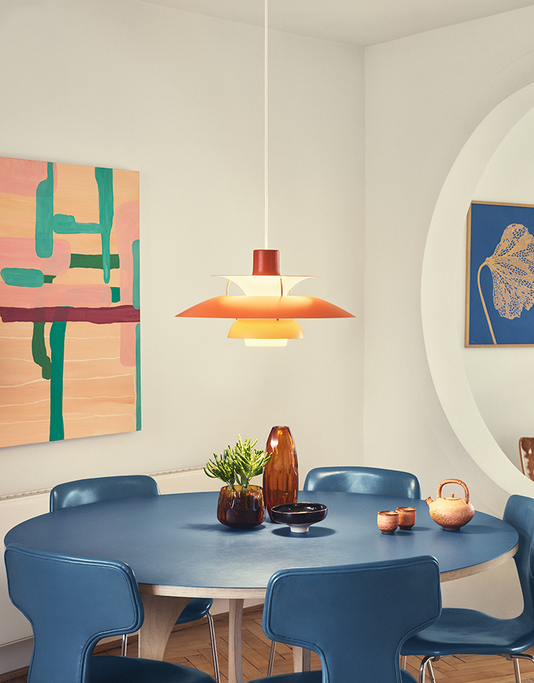
Saturated Orange & Red-Orange
Energy and warmth
Warm oranges are among the most stimulating tones in the spectrum, associated with sociability, confidence, and physical warmth. In a living room, a single orange piece reads like an invitation. In a dining space, it sharpens appetite and conversation.
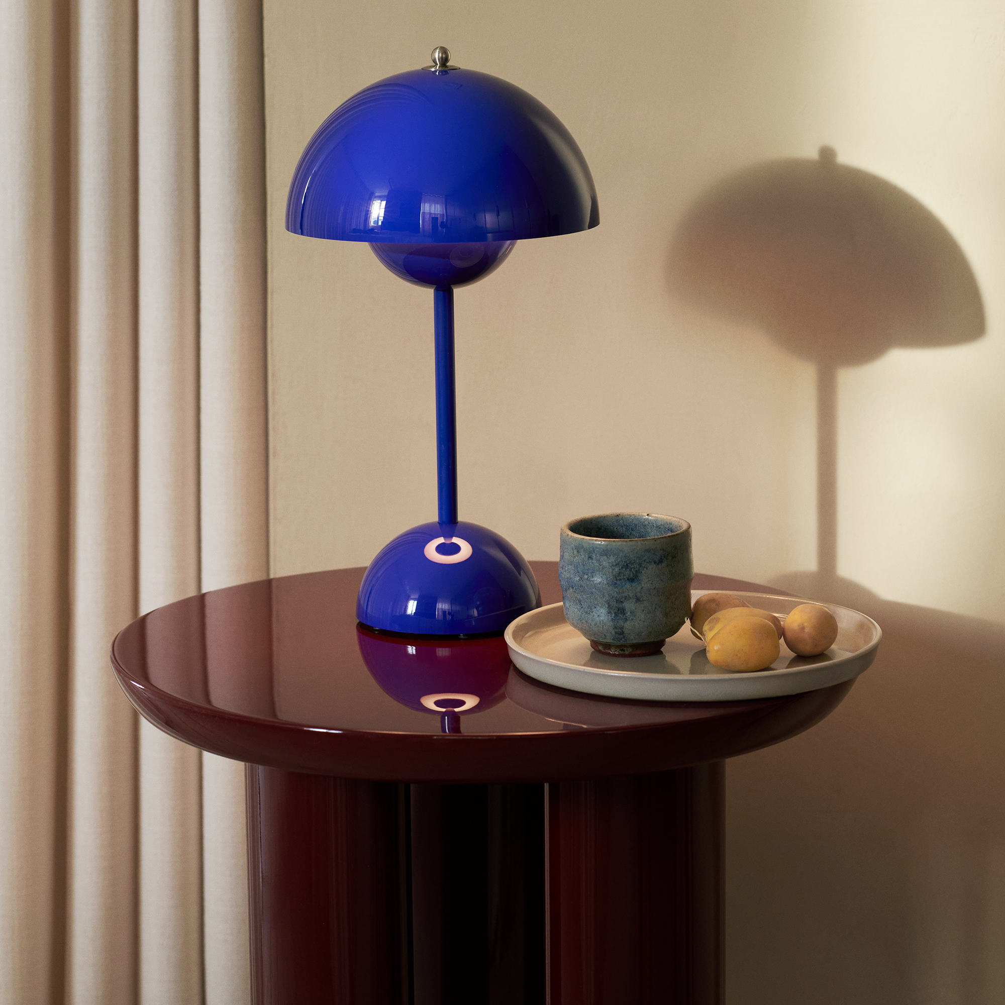
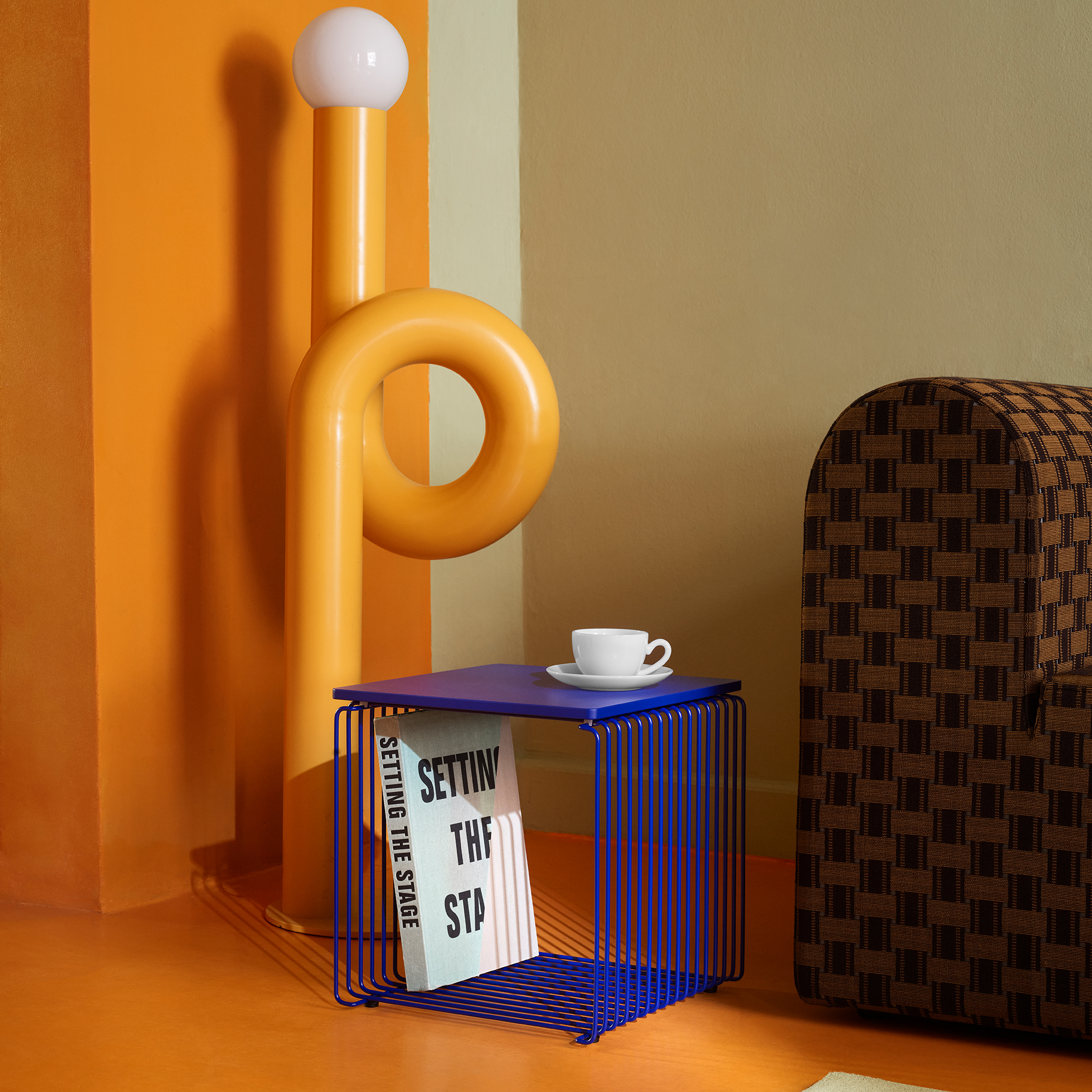
Cobalt, Periwinkle & Deep Blue
Depth and calm focus
Blues slow the pulse and deepen concentration, but saturated cobalt and periwinkle carry enough presence to hold a room. They're the cool counterpart to warm dopamine palettes, the color you pair with orange so neither dominates, and both shine.
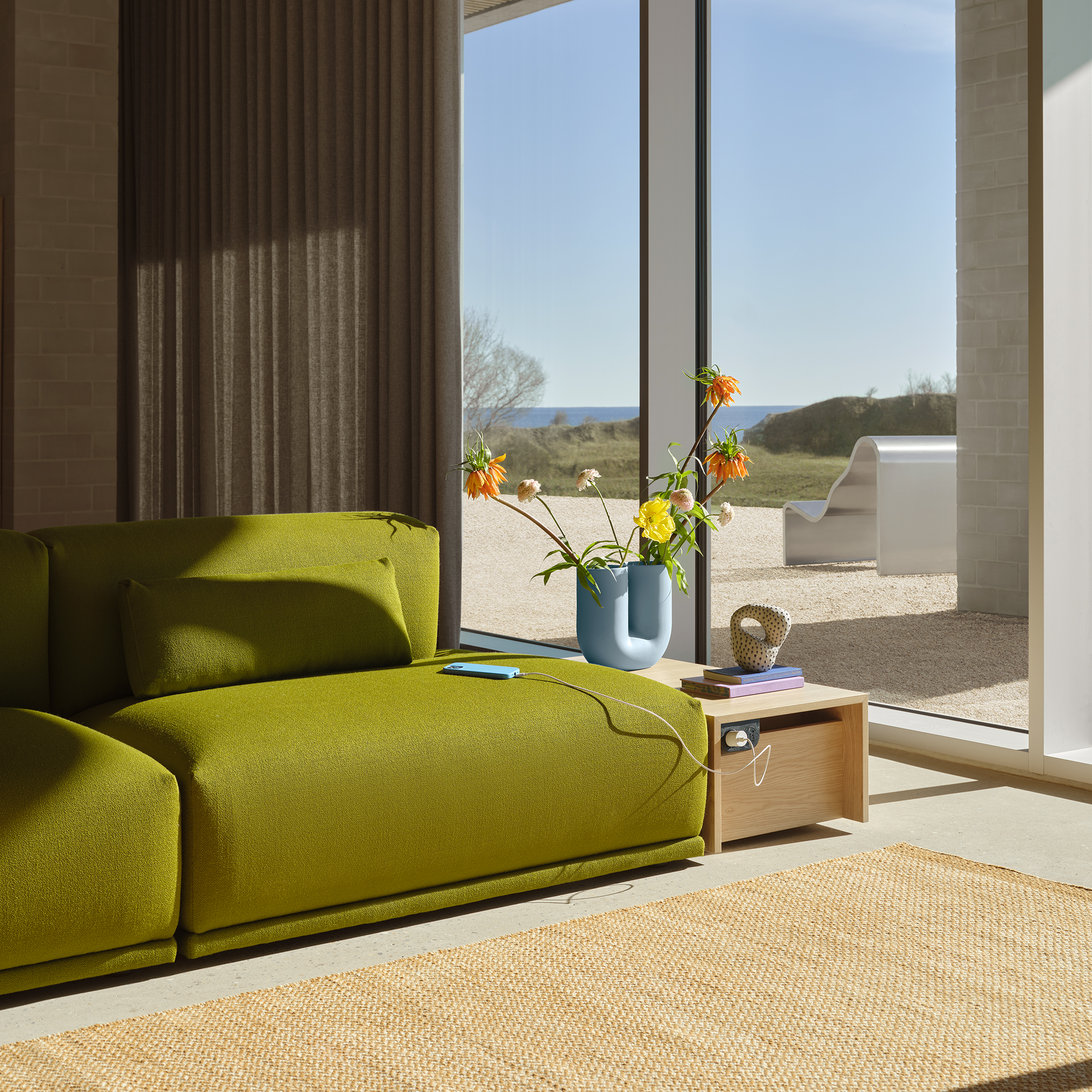
Pistachio, Signal & Grass Green
Renewal and lightness
Green reads to the brain as natural and restorative, the color we associate with growth and ease. In its more saturated, joyful forms like pistachio, bright green, and chartreuse, it brings a freshness to interiors that neither orange nor blue can replicate on their own.
Dusty Rose & Soft Pink
Softness without retreat
Pink, particularly muted powdery versions like dusty rose and petal, adds warmth without the intensity of orange. In dopamine palettes, it's the tone that makes a bold room feel livable: the exhale after the statement piece.
Butter Yellow & Golden Chartreuse
Light and optimism
Yellow is the color most consistently linked to optimism and mental clarity in color psychology research. In its softer, buttery forms it adds luminosity to any palette. In its more electric forms like chartreuse and golden green, it introduces unexpected graphic tension.
Plum, Mauve & Deep Violet
Depth and mystery
Purple is the complement to yellow in the color wheel and one of the most grounding tones in a dopamine palette. It adds drama without darkness. A touch of plum against tangerine and butter yellow creates a combination that feels both vibrant and sophisticated.
A Practical Guide
How to Decorate with Dopamine Decor
The most common mistake in dopamine decorating is starting with too many colors at once. The most effective rooms in this palette begin with one clear anchor and build outward with intention. Here's how.
Start with one color that genuinely excites you
Not the color you think you should like. The one you actually do. This becomes your dominant tone, the color that shows up in your largest piece. Everything else is built in relation to it. If you're unsure, start with our five color stories and notice which one you keep coming back to.
Apply the 60-30-10 rule
One dominant color (roughly 60% of the room's color presence), one secondary (30%), and one or two accents (10%). This ratio gives every color room to breathe and keeps the room cohesive rather than chaotic.
Prioritize lighting and seating above everything else
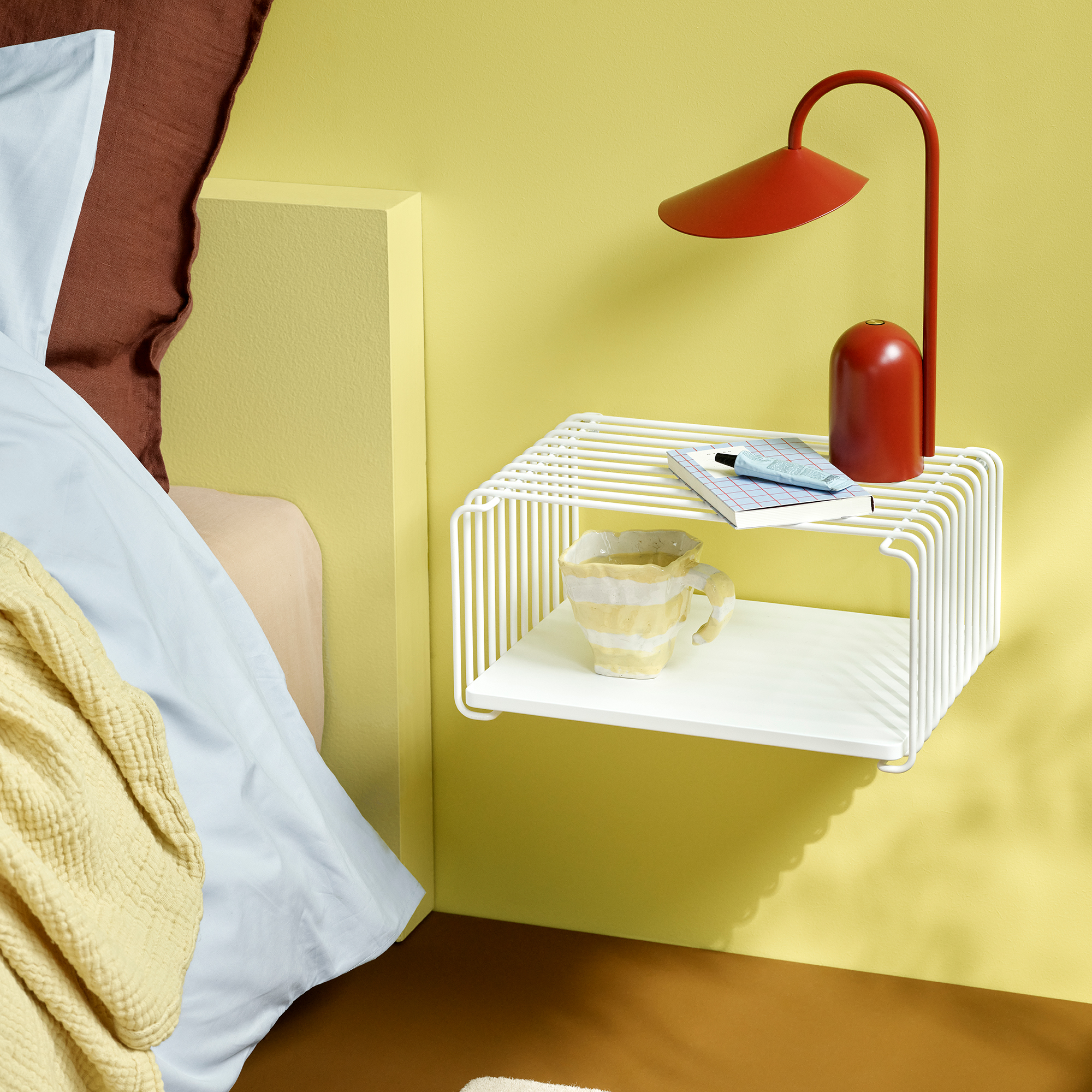
A bold pendant and an expressive sofa or lounge chair do more for a room's mood than any accessory. Get those two right and the rest follows. After seating and lighting, the rug is your second-most important lever: it grounds the palette and makes individual pieces feel like they belong together.
Repeat each color at least twice, at different scales
If cobalt is on the sofa, it should appear again on a lamp or a vase, but in a smaller dose and at a different saturation. Vary the scale (large surface vs. small object) and the saturation (deep cobalt sofa, lighter periwinkle cushion) to keep it dynamic.
Let it evolve — dopamine decor is never finished
The beauty of a dopamine approach is that it's an ongoing conversation with your space. Add a new color story through a rug or pendant. Edit out the pieces that have stopped making you feel anything. The furniture, if you've chosen well, holds its value through every iteration.
The Dopamine Decor Edit
Five Color Stories. Infinite Starting Points.
We built our Dopamine Decor Edit around five distinct palettes, each one a mood rather than a category, with pieces chosen because they belong together. Start with the palette that speaks to you.
Choosing the Right Pieces
What Makes a Piece Dopamine Furniture?
The term "dopamine furniture" gets used loosely, but there are real distinguishing characteristics that separate furniture worth investing in for this approach from pieces that merely arrive in a bold colorway.
Color integrity over time
The best dopamine furniture holds its color through decades of use. Lacquered surfaces from manufacturers like Montana are formulated to maintain their hue without yellowing or fading. Powder-coated metals, solution-dyed textiles, and high-quality pigmented veneers all age better than surface-applied finishes.
Form that earns the color
Color should amplify a strong form, not compensate for a weak one. The pieces that work hardest in dopamine interiors are those where the design itself is expressive: the organic curve of a Copacabana lounge chair, the graphic dome of a Flowerpot pendant, the repeating geometry of a Panton Wire shelf. The color becomes more potent when the silhouette is already doing something interesting.
Pieces designed by designers, not trend cycles
The Ant™ Chair, the PH 5 Pendant, the Girard® Color Wheel Ottoman: these exist in bold color not because a trend called for it, but because the designers who created them understood color as a fundamental material.
Restraint in quantity
Dopamine furniture doesn't require a dopamine-colored everything. One fully committed piece, a bright green sofa, a tangerine TV bench, a cobalt lounge chair, does more for a room than six muted pieces trying to be interesting. The most effective dopamine rooms have a clear hero piece and a carefully edited supporting cast.
Common Questions
Is Dopamine Decor Just Maximalism?
This is the most common misconception. Dopamine decor is not a quantity question, it's a quality of feeling question. You can achieve it with a single bold sofa in an otherwise restrained room, or go full maximalist with pattern on pattern. Both are dopamine decor.
What unites the range is the commitment: every piece is chosen because it makes you feel something.
The opposite of dopamine decor isn't minimalism. The opposite is indifference, rooms designed around neutrality for its own sake, where no piece was chosen because it sparks joy.
Frequently Asked Questions
Everything You Want to Know About Dopamine Decor
Will dopamine decor date quickly?
The furniture in a well-considered dopamine interior is designed to last decades, not because it's trend-proof, but because it's genuinely well-made by designers who weren't following trends in the first place. A Panton Chair, a PH 5 Pendant, a Montana shelving unit: these were strong objects long before the dopamine trend gave them a name. The palette is yours to evolve. The furniture holds its ground either way.
How do I mix colors without it looking chaotic?
Repeat each color at least twice in the room, once large, once small. Vary the scale and saturation rather than the hue (deep cobalt sofa, lighter periwinkle cushion). Keep one dominant color, one secondary, and one or two accents. And trust your own reaction: if it makes you genuinely happy when you walk in, you've got it right.
What's the best room to start a dopamine decor approach in?
Start in the room you spend the most time in. For most people that's the living room, which gives you the most surfaces to work with and the biggest opportunity to feel the effect. If you want to start smaller, a bedroom is forgiving: a single bold lounge chair or pendant in an otherwise neutral room creates significant impact with a limited commitment.
Can dopamine decor work in a rental apartment?
Absolutely. The most powerful dopamine elements, lighting, seating, rugs, and accessories, are all portable. A bold pendant, a statement sofa, a strongly colored rug, and a few expressive objects will transform a rental without touching a wall. When you move, the furniture moves with you.
How do I choose between the five color stories?
Notice which one you keep returning to rather than which one you think makes the most design sense. Each story is built around a mood first, a palette second, and individual pieces third. Start from the feeling, not the color wheel.
Is there such a thing as dopamine decor for a home office?
Yes, and it might matter most there. Color psychology research consistently shows that bold, saturated environments improve motivation and reduce mental fatigue in work contexts. A signal-green desk, a warm orange pendant, or a strongly colored task chair can meaningfully change how you feel at your desk across a long day.
Ready to Start?
Shop The Dopamine Decor Edit
Five color stories, five moods, each built from pieces curated to belong together. Start with the palette that speaks to you, or let our design team help you find your anchor color.

